DEETS digital business cards, a simple and powerful way to grow your personal and professional connections

Supercharge the way you network.
The Problem:
For the modern-day digital networker, traditional business cards no longer cut the mustard. There is a need for an easier way to share contact details, portfolios and social links whilst hanging onto the fun and personal flare of traditional physical cards.
Deliverables:
Test all tasks in app apple to apple, android to android, apple to android and android to apple to iron out any bugs and make UX/UI recommendations.
Determine what features and benefits are critical to launch success, specifically to saving to phone contacts and card design. Advise what can be improved in the current card design.
Identify and recommend the best offer for users to purchase DEETS (move from the FREE version). Please identify the best offer and flow to do this comparable to our competitive set
The Opportunity:
Deets digital business cards are passionate about empowering people to establish and maintain connections in order to expand their personal and professional networks. Before a soft-launch of their initial product on various app-stores, my team an I were tasked on conducting a ux/ui audit and making recommendations and redesigns where necessary.
My Role:
Project Lead of team of 10 UX/UI Designers
Hitting The Road
The Process
Our initial priority, given the length of the design sprint, key deliverables for the client and the stage at which the app was at, was to test the app across different devices and report back any key bugs we identify. While we recruited users for more testing later in the piece, we undertook functional tests of the app within our team to identify bugs. This allowed us to spend the time necessary to test specific functions of the app repeatedly, ensuring detailed reporting for the client and opening up time to be spent more wisely with our users in later behavioral and task-based interviews.
As the app was set to ‘soft-launch’ in 10 weeks from the time we started the project, the insights we found would be integral for the team in terms of prioritisation, proposed timelines and must-haves vs nice-to-haves. We identified 15 critical bugs that would greatly impact user experience as well as the success of the app which we reported to the stakeholders immediately. Some of the bugs were outside of our scope so we highlighted which areas we would focus on from our findings.

Discovery
Following our internal bug-hunt, we required an effective, impactful and cost-effective method for early identification of usability issues in the user interface, so we undertook a Heuristic Evaluation.
This approach offered quick feedback, focused on common problems, and served as a benchmarking tool, complementing other usability testing methods for a comprehensive understanding of the user experience.
The heuristics showed the app could be improved in a range of areas with the following identified as critical:
Match between system and real world
Helping users recognise, diagnose and recover from errors
Aesthetic and minimalist design
Flexibility and efficiency of use
Error prevention

To gain insights into industry trends, identify best practices, and enhance Deet's user experience, we undertook a competitor analysis. The callouts are as follows:
HiHello and Blinq stood out with their new user onboarding and card design templates.
They also both had locked features which encouraged users to upgrade. Haystack UI and features paled in comparison.
Deets stood out in terms of the level of customisation offered, for example being able to change the color of QR codes and allowing users to truly choose the look and feel of their business cards. Also contacts automatically updating were a stand out.


Networking with networkers:
1:1 Interviews

We conducted interviews with 11 professionals, with the majority of interviewees falling within the early to mid-30s age range.
Interviewees came from diverse industries, including architecture, management consulting, investment, business ownership, social work, public relations, software engineering, and civil engineering.
Interviewees completed tasks on the DEETS app and rated their difficulty. We also asked about critical features for app success.

Insights
User Delights
Concept of the app: Users liked the concept of seamlessly sharing contact information through QR code.
Card customization: Users enjoyed customising their cards and were happy about the amount of details that can be included.
Multiple business cards: Users liked the option of creating of multiple business cards to share with different audiences.
Automatic contact update: Users liked that there was an option to automatically sync contacts in their contact details.
Sharing business cards: Users liked being given more than one option to choose from when sharing their contact details.
Social media links: Users liked the option to link other platforms onto the app.
User Pain-Points
Onboarding: Users expected to see home page and their business card separately.
Sharing card to DEETS non user: Users found it confusing to save the card to phone contacts as they expected it to be saved after they clicked ‘Done’.
Multiple Card creation: Users could not figure out how to create multiple cards or if it was possible at all.
Styling card: Users found styling their business cards challenging, as UI is not intuitive enough to understand how to complete tasks related to customization.
Feedback mechanism: Limited visual feedback provided to let a user confirm if an action was successful.
Data Security: Users had questions and concerns in regards of the privacy policy and how safe their information is kept.
Common Voices:
Synthesis
We gathered and analyzed the data and insights acquired in the research phase to define the problem, set clear goals, and establish the project's scope

We used an affinity map as a visual tool that helped us organize and categorize ideas, data, and insights generated during our research, facilitating the identification of patterns and themes.
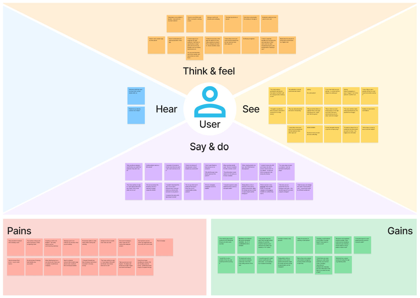
Secondly we used an empathy map to capture and organize insights about Deets user's thoughts, feelings, and experiences to enhance understanding and design more empathetic products and services.
This allowed us to better ideate and design with the user at the forefront of our decisions.
User Quotes
“Why would you design a card if when you send it to someone they don’t see it”
“I’m not a designer, templates would be helpful”
“I assumed I’d be able to create more than one card - but I can’t see how to do it”
“It’s not clear what you are editing - where will the image go that I am editing?”
Mapping Pains & Gains:
Customer Journeys

Sharing- Deets user to non Deets user:
- users value having multiple options in how to send their details- via msg, qr code, email link etc
- sending contact details via Deets is simple and enjoyable, but the receiving element for non-Deets users is challenging and causes friction
- instructions unclear for how non-users save contact details to phone

Sharing- Deets app to Deets app
- saving contact details to phone instructions interrupt the flow of using the app
- users value ability to edit contacts once they’ve scanned QR code
- frustrations surrounding ease to send back a Deets card, rather than basic info details
- redundant end of journey prompting Deets app users to download the app

Creating a new card
- ambiguous process to create a new card. Users unaware that there was an option to do so
- frustrations with lack of autofill from previous card, what delay the overall process
- the end result is often unfulfilling because of the challenging process to get there and the difficulties in designing an appealing business card

Styling a card
- users initially love the card styling project, but become overwhelmed by the lack of direction (there’s too many options)
- frustrations surrounding trial and error and lack of previews when editing
- process is time consuming and may leave users with a bitter taste once complete, if the final product is not to their liking
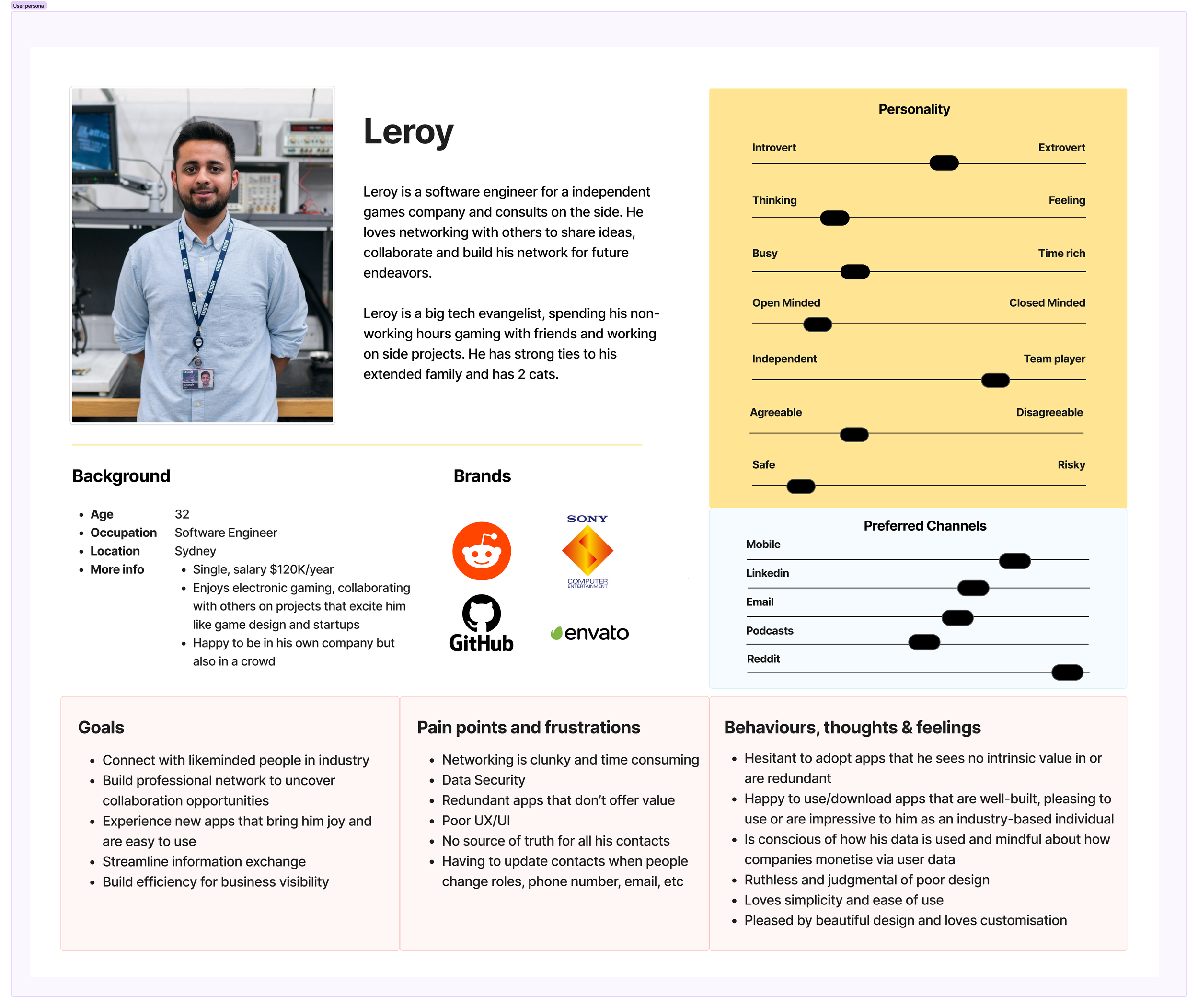
The Networker
User Persona
Reframing The Problems
HMW’s
Taking a problem solving approach to the research insights, keeping the user at the forefront of our efforts
How might we enhance the sign-up and contact details section to create a more frictionless onboarding process?

How might we make the card design process more intuitive and efficient?


How might we reduce potential errors to make contact sharing more seamless

As a group we voted on the concepts that best addressed the HMW problems and mapped them out on a minimum viable product matrix.
In analysing each matrix, it became clear that the green ‘quick wins’ section were largely hygiene factors such as changing the font to lowercase in many areas, updating the flow for ‘creating a new card’ navigation, updating interface icons to be more relevant, and making certain calls to action more prominent.
There were also some fantastic value add concepts such as a dedicated home screen, ‘rollodex’ view for contacts and a logo search and placement functionality within the card styling process
Narrowing The Scope Of Work
Post-research the team realised the amount of hygiene-related uplifts and bugs that needed to be addressed before the proposed launch in a few weeks time. Because of this, we had to limit the amount of ‘value-add’ features of our designs to ensure we completed quality work across what was possible, instead of mediocre work across a lot of areas.
In liaising with the client, it was decided that we would focus on objective 1 and 2, and leave objective 3:
(Identify and recommend the best offer for users to purchase DEETS (move from the FREE version). Please identify the best offer and flow to do this comparable to our competitive set")
Lastly, due to the amount of uplift required, it was flagged that we could undertake user testing amongst ourselves as a team, but that further testing should and would be undertaken be Deets at a later stage.
Seamless User Flows:
Networking Harmonized

Existing Log In/Sign Up User Flow
New Log In/Sign Up User Flow

The key uplift here is that the information users are prompted to fill out are used to not only create an account, but will also be populated as a draft on user’s first digital business card, minimising double handling of information already provided

Existing Card Styling User Flow

New Card Styling User Flow
For the card design/styling flow, we re-looked at the information architecture of the entire screen, as users were confused by the ‘style’ menu, especially the sub-menu for uploading images, which we’ve re-designed as clickable elements.
Colour choices for background, text and QR codes have also been simplified to prevent users from making ‘bad design decisions’

Existing Sharing User Flow

New Sharing User Flow
The deets sharing flows were amended to provide feedback confirmation once a deets user’s details were saved within the app, clarifying ambiguity for users, and a ‘notes’ section whereby users can add custom notes to cards they have received in their deets app.
Redesigning the Networking Experience
App Design
Wireframes

Low fidelity mockups of business card rolladex, contacts views, card styling and card sharing


One of the most noticeable things about the existing app was the lack of brand consistency.
At the home screen we ensured the electric color pallets were utilized and created a dedicated landing page with previews available for the user’s different business cards to quickly access and share their deets efficiently. Lastly we added in a nav bar to further simplify navigation.

In designing the contacts section, we brainstormed concepts that brought us joy surrounding the act of swapping physical business cards.
What emerged was not only the joy of examining someone’s personality as shown by their personal design choice, but also the nostalgia of the Rolladex, where one can flip through their cards. And so, we incorporated a scrolling Rolladex view for contacts, reinforcing the brand positioning of Deets’ card design options as well as a list view for easy search/navigation.


To streamline the design process for users, we implemented some prebuilt color pallet templates to choose from. For non-design natives, card design was one of the most frustrating areas of using the app for users.
Furthermore we added toggle functionality for displaying certain info, so that business cards don’t look blank when certain info sections are redundant.
Lastly, we incorporated a ‘quick tap’ pad for adding social media and other external links to one’s business card, as well as company logo search functionality.


To enhance the design functionality value proposition of sharing one’s Deets business card, we created a mini version of user’s card designs that are actually sent to recipients within sms, whatsapp, etc. This design decision was specifically based on user feedback ‘why would i go to the effort of designing a card of they don’t see it when it’s sent?’
Users were frustrated with the the lack of feedback once they shared their Deets successfully, so we incorporated haptic feedback as well as prompts informing users. Secondly, we add in-app functionality for users who already have the Deets app to simply be able to select a card they wish to share back, rather than sharing via sending link to Deets card.

For the more active and organised user, we incorporated a grouping functionality, allowing users to create sub-sections of their users for specific events or categorization.
Closing Thoughts
The Learnings
While the client was aware there were bugs to be found in their early iteration of the app, they were quite surprised by the amount that we, as a team, located in the early stages of the sprint. Identifying these and designing for them, as well as from the research, created a large amount of work that was to impact our ability to finish within the allocated timeframes.
I learned that conversations early on about the scope of the project, as well as the ‘must-haves’ vs ‘the nice-to-haves’ are essential to ensure all stakeholders have realistic expectations about what can be effectively completed within the timeframes. While this is important for all designs, it’s especially true for design sprints.